|
|

Eyrie Productions, Unlimited
 |
Gryphon
Charter Member
22420 posts |
Oct-15-08, 01:40 PM (EDT) |
    |
4. "RE: TIA #3 poster"
In response to message #1
| |
>I actually loved the "War Machine" look moreso than the silly
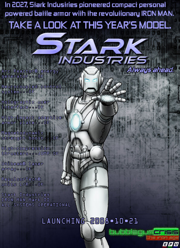
>red/yellow design, IMO. The "silly" color scheme serves a useful purpose in its original context (and one that is no less useful in TIA, come to that): It was designed to reassure the public that Iron Man was not a monster or a mindless weapon, something for the average citizen to fear and loathe. I suspect the Knight Sabers' hardsuits are brightly colored for similar reasons (and for recognition, of course). They're also the colors of Tony Stark's elementary school, if you believe Adam Warren. :) --G.
-><-
Benjamin D. Hutchins, Co-Founder, Editor-in-Chief, & Forum Admin
Eyrie Productions, Unlimited http://www.eyrie-productions.com/
Ceterum censeo Carthaginem esse delendam. |
|
|
Alert | IP |
Printer-friendly page | Edit |
Reply |
Reply With Quote | Top |
|
|
|
|
Gryphon
Charter Member
22420 posts |
Oct-15-08, 01:46 PM (EDT) |
|
|
6. "RE: TIA #3 poster"
In response to message #2
| |
>Hmmm. You put an actual date on it. Yeah, well... don't get too excited. They put a date on Duke Nukem Forever once, too. :) More seriously, nothing is ever entirely certain, but the person on the hook for the two remaining scenes is aware of the poster, and I'm reasonably confident that I can pinch-hit if it doesn't work out for him. --G.
-><-
Benjamin D. Hutchins, Co-Founder, Editor-in-Chief, & Forum Admin
Eyrie Productions, Unlimited http://www.eyrie-productions.com/
Ceterum censeo Carthaginem esse delendam. |
|
|
Alert | IP |
Printer-friendly page | Edit |
Reply |
Reply With Quote | Top |
|
|
|
version 3.3 © 2001
Eyrie Productions,
Unlimited
Benjamin
D. Hutchins
E P U (Colour)
|
 Printer-friendly copy
 RE: TIA #3 poster
 RE: TIA #3 poster
